In this article I am presenting a way to create animated iPhone-style ImageButton control in Silverlight 4. Button will have icon on it, rounded corners and will zoom-in/zoom-out on hover. It will be done programmatically, with very minimum amount of XAML.
I start with creating ImageButton class. I use ButtonBase as base class:
I want my button to contain rounded rectangle with shadow and image on it. I add these items in constructor:
Now my control contains rectangle and image laid out over a grid to ensure proper items positioning. Next step is to add animation to enable zoom-in/out on hovering. This can be achieved with storyboards and double animations:
To start animations I need to start animations when mouse cursor enters or leaves control:
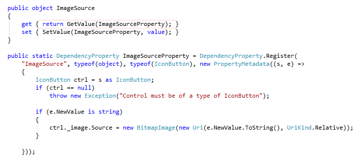
Very last step is making ImageSource property “bindable” so you can specify image from XAML. In order to do this I register new dependency property on my class:
The control then can be used in a following way:
And ready controls looks like this:


What an awesome idea! Although it could be improved with using a default template and viewstates.